Recently, I attended a workshop on data visualization. Data visualization, or “data viz,” is a variety of methods of making sense of data through visual representation – anything from a basic excel graph, to infographics, to complex animations. Although it might seem like merely a beautifying process, data visualization is a form of analysis that aims to uncover insights that would be difficult to glean from the raw data.
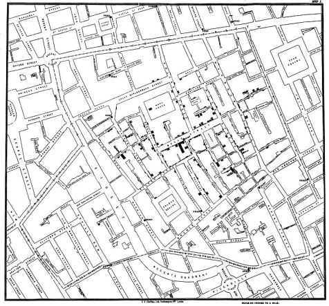
And even though data viz has become a catchphrase of the modern era of big data and advanced graphics programs, the history of visualizing data is long. One famous example is the map created by John Snow showing the locations of cholera outbreaks during the 1854 epidemic in London. Despite coming several years before the advent of germ theory, this simple visualization helped Snow to correctly hypothesize that cholera was spread via water and pinpoint its origin to a contaminated Broad Street water pump.

Data viz can be used to answer questions. Rows and columns of numbers can be hard to parse, but a good visual representation can communicate meaning much more easily. What separates good visual representations from the bad? The workshop began to dive into that question.
To start, basic things like labels, legends, and a descriptive title are essential. Accuracy and fair representation are also very important. Any good visualization must start with clean and accurate data. Beyond that, there are many decisions that go into the design process that must be evaluated. Even something as simple as color scheme can skew how the data is interpreted by the viewer. It’s important to be aware of biases, whether methodological, cartographic, or cultural. Some decisions are clear, but often there can be legitimate debate about what the best way of visualizing something is. Lastly, data viz is a design discipline, so it draws on the best practices of classic visual design.

In terms of gaining insight, comparison is often the key. Emphasizing comparison over description typically produces more informative visualizations. Rather than illustrating measurements of a single component (say, the density of street trees in NYC, to borrow an example from the workshop), combining it with a second factor (average income by neighborhood), can answer questions and illuminate the nature of a possible relationship between the two (are more trees planted in wealthier areas?).The workshop that I attended focused on the geospatial representation of data using free tools like CARTO and Tableau. Using data that included longitude and latitude coordinates, we were able to plot the data on a map in a variety of ways. Common methods include basic plotting (points on a map), cluster maps (using size to denote count), and choropleths (using shading to represent density in units, such as within a county or state). We also sampled the large corpus of data that’s being made available through the NYC Open Data project, collected from nearly 100 area departments and agencies. If you want to try your hand at data visualization, head over to the NYC Open Data site to follow their beginner tutorial using 311 request data.

Data visualization is a complex field with many methods, so if you’d like to learn more, this Data Visualization guide from Duke University provides a good overview, or check out some of the related titles in the Touro Library collection listed below.
References
Marden, J. (18 July 2017). Data Viz for Librarians. Presentation at the Intro to Data Visualization workshop for the Metropolitan New York Library Council (METRO), New York, NY.
Further Reading from Touro Libraries:
- Building Responsive Data Visualization for the Web by Bill Hinderman, 2015
- Cool Infographics: Effective Communication with Data Visualization and Design by Randy Krum, 2013
- Core Concepts in Data Analysis: Summarization, Correlation and Visualization by Boris Mirkin, 2011
- Data Visualization: A Successful Design Process by Randy Kirk, 2012
- Storytelling with Data: A Data Visualization Guide for Business Professionals by Cole Nussbaumer Knaflic, 2015
Contributed by Chelsea DeGlopper, Former Instructional Design Librarian, Midtown